No. 11 · Physical therapy
Kestrel Physical Therapy
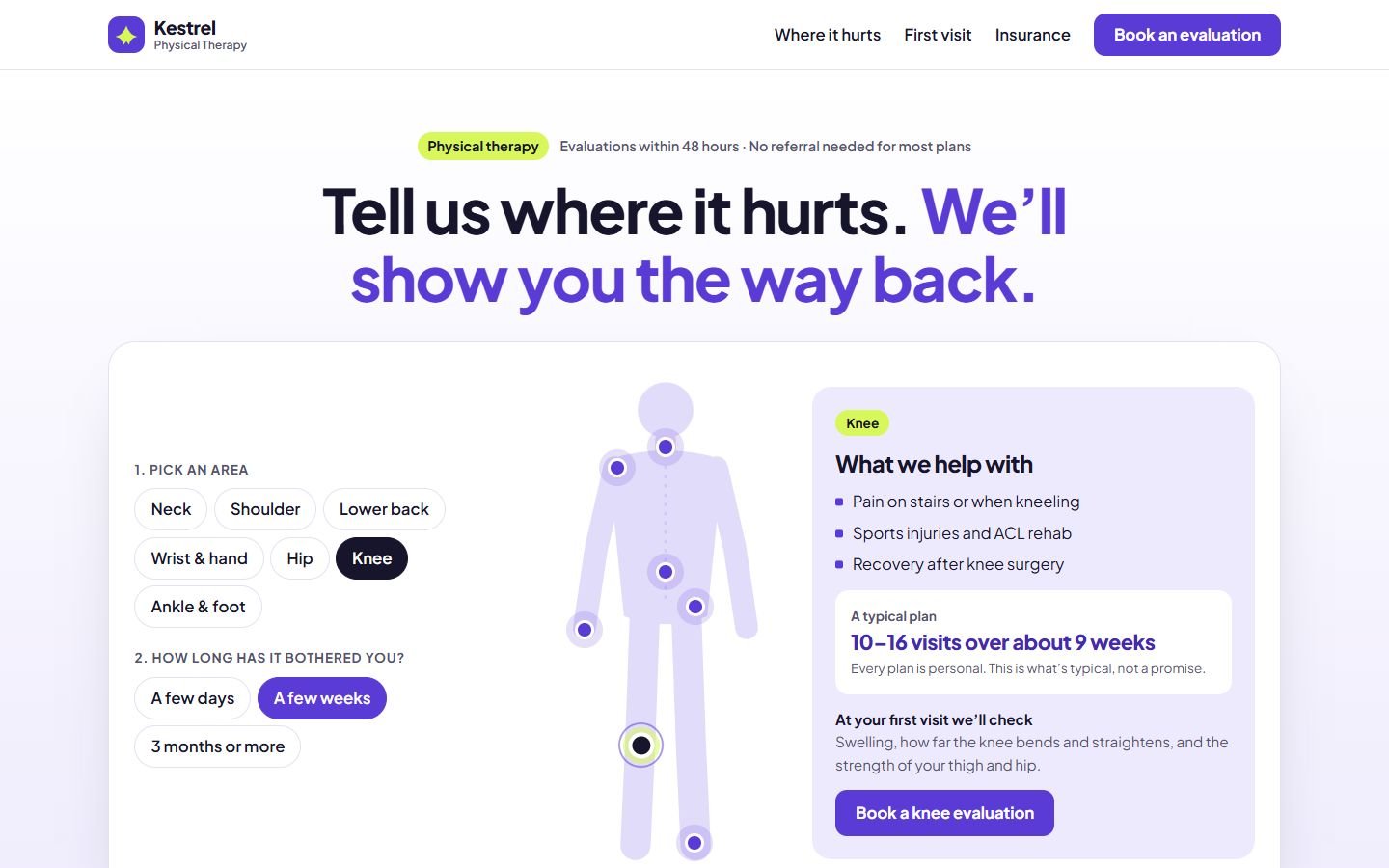
A physical therapy website built around a body map. Pick where it hurts and for how long, and see what the clinic treats and what a typical plan looks like.
- Classification
- Independent concept
- Business
- Kestrel Physical Therapy (fictional)
- Project type
- Single-page website concept
- Year
- 2026
- Type
- Plus Jakarta Sans
The brief
The brief
Design a website for an independent physical therapy clinic. People in pain search by symptom ("knee pain on stairs"), not by treatment name, and they want to know how long recovery takes and whether insurance covers it. The site should start from where it hurts and end with a booked evaluation.
Goals
- 01Let visitors start from their symptom, not from medical terms
- 02Set honest expectations about how many visits it takes
- 03Explain insurance and self-pay clearly
- 04Turn interest into a booked evaluation
On every screen
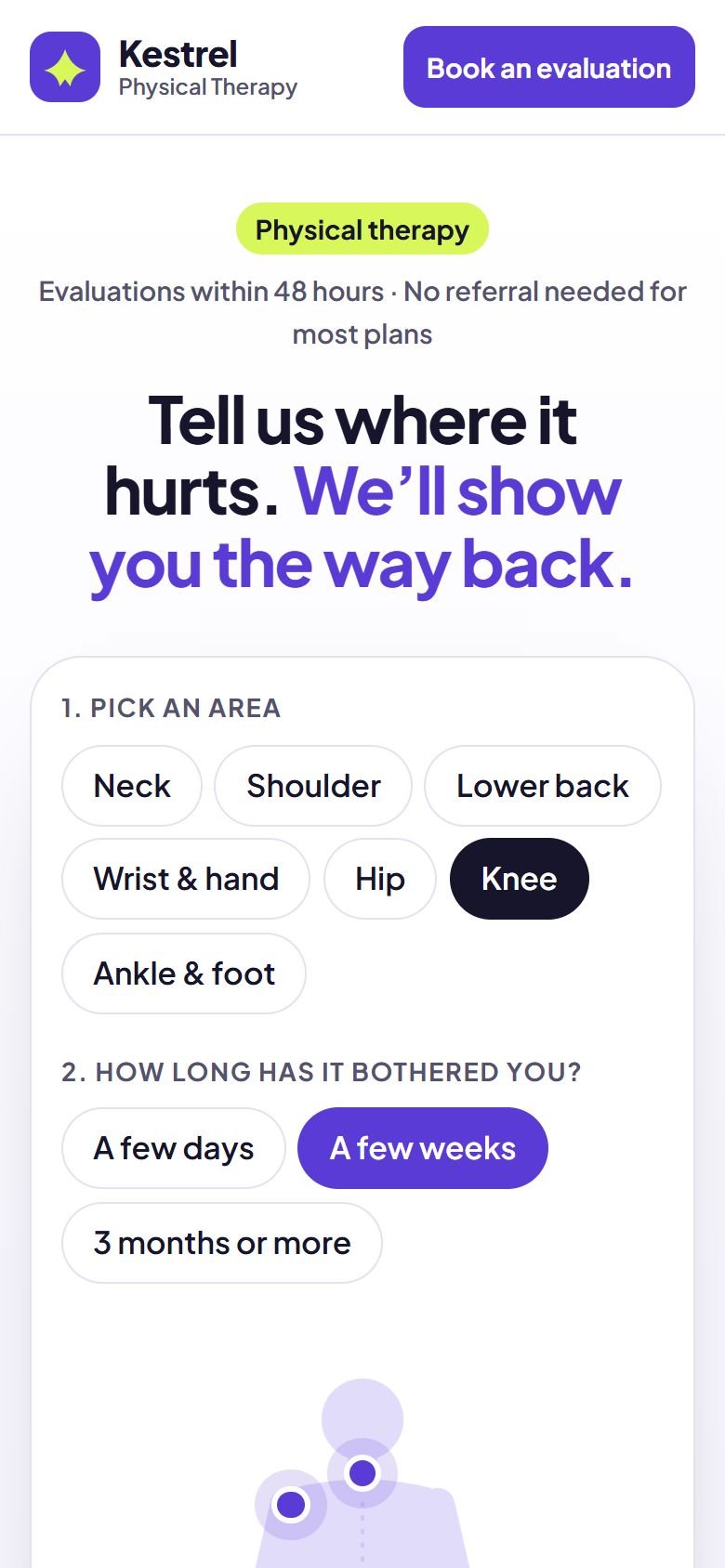
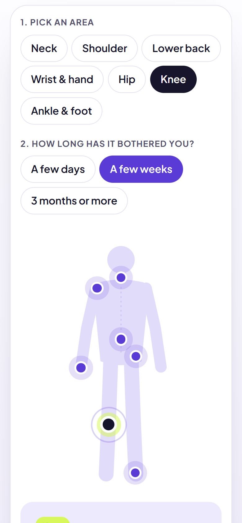
Designed for phones first
The work
The approach
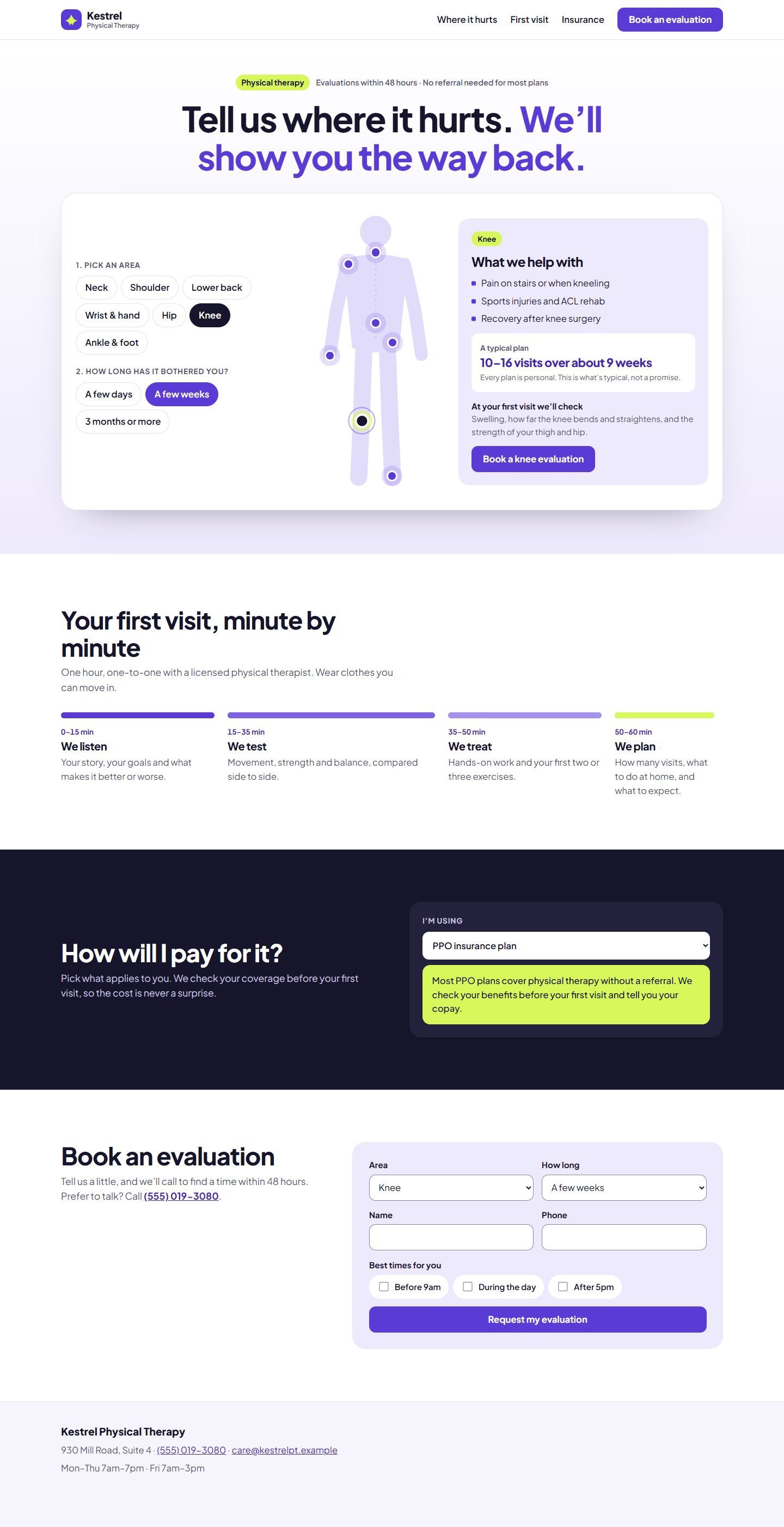
Nobody searches for “manual therapy and therapeutic exercise”. They search for “knee pain on stairs”. So the page starts with a simple question, where does it hurt?, and a body map. Choose an area and how long it has bothered you, and the panel shows the common reasons people come in, a typical plan and what the first visit will check.
Ultramarine with a lime highlight is energetic and modern, closer to a sports brand than a hospital, which suits a clinic that’s about getting people moving. Plus Jakarta Sans keeps it clean and friendly.
Decisions worth noting
- The list is the real control. The areas are radio buttons that work with a keyboard and screen reader. The dots on the figure are a shortcut for mouse and touch users, not the only way in.
- Honest numbers. The plan updates with how long the pain has lasted, and says plainly that it’s typical, not a promise.
- Money questions answered early. The coverage helper explains what each kind of insurance needs, so nobody arrives without a referral they needed.
- Nothing typed twice. The booking form already knows the area and duration you chose.
How it’s built
One static page. The body figure is inline SVG; the map, plan and coverage helper are a few lines of JavaScript. The first-visit timeline is drawn to scale with CSS grid. The font is self-hosted.
What would change for a real client
The clinic’s own therapists and specialties, its real insurance list and self-pay prices, and a link to its scheduling system.
What’s on the site
Features actually built
- Body map with seven areas, controlled by an accessible list of choices (the dots on the figure are a shortcut)
- Typical plan that adjusts to how long the pain has lasted, labeled as typical, not a promise
- First-visit timeline drawn to scale, minute by minute
- Coverage helper for PPO, HMO, Medicare, accident claims and self-pay (sample self-pay prices)
- Booking form pre-filled with the chosen area and duration (demonstration only, nothing is sent)
Palette
- Ultramarine
#5B3BD6 - Lavender
#EEEAFD - Lime
#D7F75B - Ink
#17152B